For the third election cycle in a row, Nate Silver is winning praise as the guru of election forecasting. There’s a lot of confusion about what he does and doesn’t do, so here’s a quick guide to why his record is a big win for mathematics rather than gut instinct.
Who is Nate Silver?
Silver is a former economic consultant who developed a system for analyzing baseball player performance and forecasting the likelihood of their future success. He later adapted his techniques to political forecasting and won attention in 2008 when his forecast likelihoods came off in reality for 49 of the 50 states in the presidential election and all 35 Senate races. He later began writing for the New York Times and made predictions for the 2010 mid-terms, coming close but not quite as accurate as in 2008.
How did he do this time round?
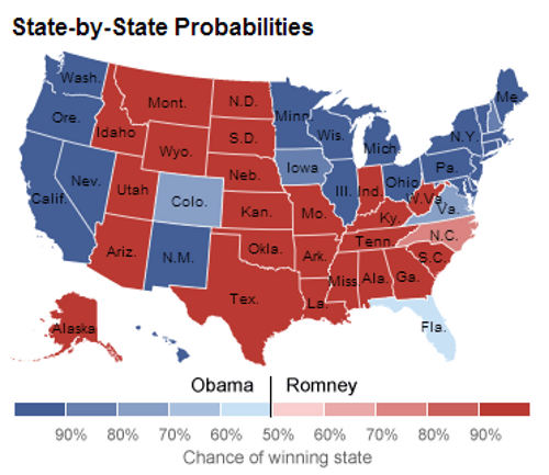
In all 49 states (plus DC) where a Presidential race winner already looks clear, the candidate Silver ranked more likely to win did so (pictured). He had Obama a slightly favorite in Florida, which at the time of writing was not yet a clear result though Obama was ahead on votes that had been counted. Silver rated Obama a 90.9 percent favorite to win the Electoral College in his final analysis on election day. He also forecast a 50.8 to 48.3 percent popular vote lead for Obama; at the time of writing, the Associated Press count has Obama leading 50.4 percent to 48.0 percent.
So Silver correctly predicted every state and the overall race?
Not as such. Silver’s analysis is not intended as a prediction, but rather an assessment of the likelihood of winning. By definition there’s no way to confirm that assessment was correct as the real voting only takes place once: you’d have to run the race numerous times to even begin checking a likelihood forecast was correct. In the same way that a Romney victory wouldn’t have proven Silver wrong, an Obama victory doesn’t prove him right. What we can say is that taking all the individual states into account, his analysis certainly comes across more credible in hindsight than many rivals.
So how does he do it?
Silva’s talked about the details of his technique, but the explanation here is a slight simplification to show the general principles. It’s a two-stage process: first assessing the likelihoods in each state, than translating that into a nationwide prediction.
The main data gathering and analysis is simply gathering together all available opinion poll results, the logic being that polling is generally accurate but with statistical margins of error that should be reduced heavily by combining multiple polls. However, Silver doesn’t simply average the polls but rather weights them based on a combination of their sample size, how recently they were conducted, how they addressed the stated likelihood of respondents to actually vote, and the past performance of the polling company (a comparison of their previous polls and the actual results of the race concerned.) The idea is to minimize the effects of systemic bias in which the way a particular poll is conducted consistently affects the results in the same direction.
Does Silver do anything else with the numbers?
With all the numbers Silver crunches he applies non-polling data, though the way he does so can be misunderstood. The non-polling data involved factors such as the state of the economy, the benefit of incumbency, the number of registered party supporters in particular states and so on. Silver only applies this data where analysis shows a 90 percent certainty that it correlated to previous elections and, importantly, only uses such data to plug the gaps where recent polling data is insufficient. The non-polling data doesn’t ever replace polling data.
How does this translate into a national race?
While there’s some account taken of national polling and non-polling data, Silver primarily works through simulations using a system similar to the Monte Carlo method used in techniques such as weather forecasting. This involves running simulations of the state voting based on the forecast likelihood in each state.
To give a hypothetical (and extremely simplified) example, you could start with Oregon having a 90 percent chance of going for Obama, pick a random number from 0 to 100, and chalk the state up as an Obama win if the number is from 0 to 90. Repeat this process with each state and you get a national result and a resulting electoral college winner.
What you then do is run the process many many times over and track how many times particular outcomes and Electoral College totals come out. The idea is to get an idea of how likely it is to get different combinations of states going for or against the candidate predicted as more likely to win. This also helps measure the impact of the fact that, for instance, being wrong in Ohio is more likely to make the overall result different than being wrong in New Hampshire.
How did Silver’s forecasting differ to that of pollsters and pundits?
During the entire campaign, Silver always had Obama down as more likely to win overall. At his lowest point (just after the first TV debate) Obama was still rated a 61.8 percent likely winner, a likelihood that improved rapidly in the run up to Election Day when it became less likely voters would change their minds between responding to a poll and casting a ballot. Many pundits described the race as a toss-up or neck-and-neck right up to election day, refusing to label one side as more likely to win.
So why were the pundits getting such a different outcome?
There are three main reasons, the first two of them behavioral. Pundits may have been cherrypicking polls that met their preferred results and thus getting too excited about reading supposed momentum that may simply have been down to the natural statistical variation in polling. Secondly, some media outlets may have deliberately put an emphasis on anything that suggested an unpredictable race, whether to make a simple narrative that portrayed events as significant in affecting the outcome, or simply to make for a more interesting story than telling people the result wasn’t in doubt and risking them switching off.
The main issue however seems to be people misunderstanding what the numbers Silver produced are meant to portray. A forecast that, for example, Obama has a 75 percent chance of winning does not mean you are saying that he’ll win 75 percent of the vote or even that the final vote count in a state or national race won’t be close.
The forecast is a measure of certainty of the result, not a measure of the likely margin. In other words, Silver was saying that although the result might be close, it was highly likely Obama would win — something that’s partly the result of the Electoral College state breakdown working in his favor.
In fact by the time of his forecasts in the past few days, Silver argued that an Obama win was virtually certain based on the mass of polling — the chance he gave Romney was effectively nothing more than an assessment of the possibility that the polls as a whole were systemically biased.
Ah, but Silver got the electoral college total wrong didn’t he?
Not as such. Silver did give a figure of 313 for Obama’s electoral college total but again this wasn’t a prediction, rather an average of all the simulated outcomes. This doesn’t translate to a forecast as 313 may not even be a possible total, and several previous daily assessments that had fractions clearly weren’t.
Simply as an average, the figure has come out well of course: it lies between the two possible totals (303 and 332) that are left with Florida yet to be confirmed. Whatever the result, it’s within the margin created by the closest state.
What’s more impressive though is that Silver also produced a chart of how many times each individual total appeared in his simulations. Top place, coming up as a 20 percent probability, was 332. Second place, with 16 percent, looks to be right on 303.